


Page 54 - Sustainability Report 2022
P. 54
54


      UNFCCC
      RESILIENCE
      FRONTIERS


      BRAND IDENTITY


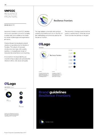
      Resilience Frontiers is a UNFCCC initiative   The logo radiates universality and symbolic   The elements in the logo present the final
      that aims to promote actions for humanity   vastness and therefore acts as an identifier of   goal of a resilient future, while the unique
      to attain long-term resilience that builds   the methodology and practices used by the   icons illustrate the pathway to the goal.
      on frontier technologies and regenerative   Resilience Frontiers.
      principles.

      Phoenix Design Aid developed a brand    01Logo                                                       3
      identity and guidelines for the Resilience
      Frontiers. The refresh of the brand     The lockup
      introduced a new logo, color palette,
                                                                                 LOGO COLORS
      typeface, iconography and design of
      templates for presentations and reporting.                                 CMYK  54-4-98-0
                                                                                 RGB  137-184-39
      All elements in the brand identity are                                     CMYK  97-93-0-0
                                                                                 RGB  48-45-136
      created to help visualize and symbolize the
                                                                                 CMYK  68-34-0-0
      initiative’s ethos, core values and goals.                                 RGB  75-146-216
                                                                                 CMYK  82-61-0-0
                                                                                 RGB  61-97-172
                                                                                 CMYK  0-0-0-100
                                                                                 RGB  0-0-0

                                              LOGOMARK        LOGOTYPE
                                              Our logomark is anchored by a circle as   Our logotype uses CamingoDos Pro,
                                              an important symbol of its universality,   the official font of the UNFCCC.
                                              symbolic vastness, and universal    That is the only place the font appears.
                                              meaning. Thus, a powerful identifier of    For information on our brand
                                              our methodology and practice.  typefaces, please refer to page 12.
      01Logo                                                       6


      Logo versions  Favicon
      ON BLACK                        ON WHITE
                                              Brand guidelines
                                              Resilience Frontiers


         Regular                         Regular
         34 x 34 px or larger            34 x 34 px or larger

                       Mini                            Mini
                       32 x 32 px  or smaller          32 x 32 px  or smaller


      The favicon is used on digital platforms in browser tab/
      history, mobile apps, search bar and social media shares,
      etc. Recoloring — using colors from the primary palette —
      is only permitted for size 32 x 32 px or smaller.


      Phoenix Design Aid ⁄ Sustainability Report 2022

